UX Case Study
Project: Website redesign
Role: UX Research, UX/UI Design
Company: The Australian Gift and Homewares Association (AGHA)
About the company: AGHA is a not-for-profit membership-based association, whose primary business is organising trade exhibition in the gift, furniture, toys and homewares industry. AGHA organises Gift Fair exhibitions, in Sydney and Melbourne, where exhibitors (wholesaler members) meet their visitors or buyers (retailer members).
Overview
The overall goal of the project was to improve the experience of each type of our users when navigating through our website to find relevant information to their specific needs. The high-order premise was simple: rebrand the website. However, we wanted to avoid doing just another rebrand exercise. We desired to bring significantly more values to our users by helping them find the information that they need quickly and primarily through our website.
The Challenge
1. Drowning in Information
The sheer quantity and lack of organisation of information in the existing website had prevented users to find what they need quickly.
2. Confusing Maze of Navigation
The organisation of certain common information in the existing website, such membership information, were duplicated under multiple sections, which consequently lead to confusion. Information is presented in two different websites which are confusing for users and hard for website manager to maintain.
The Scope
1. Improve Information Architecture
Reorganise information so that there is only one source of truth for users to consume. The aim is to combine the two websites (mentioned above) to one that serves information about the Association, membership, exhibiting at the Gift Fairs and visiting the Gift Fairs.
2. Promote Clear Navigation
Restructure the website navigation and flow of information to help users find the information that they need as effectively as possible.
The Audience
1. Exhibitors (AGHA Wholesaler Members)
To be eligible to exhibit at the AGHA Gift Fair, exhibitors must sign up to become Wholesaler members of AGHA to receive special exhibition rates as part of the AGHA Association’s member benefits.
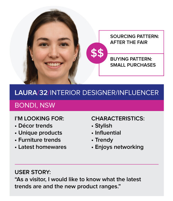
Key Exhibitor Personas
2. Visitors (AGHA Retailer Members)
AGHA Gift Fair visitors automatically become Associate members. They are buyers who attend the Gift Fairs to source products from wholesalers for their retail store. They can upgrade to be Retailer members to enjoy the member only benefits.
Key Visitor Personas
The Process
1. Investigation of the Existing Problem
AGHA currently owned two websites:
1.1. Association Website
This website contained information about the AGHA as an association and its membership programmes. This website functioned as a brochure website for the association.
1. 2. Gift Fairs Website
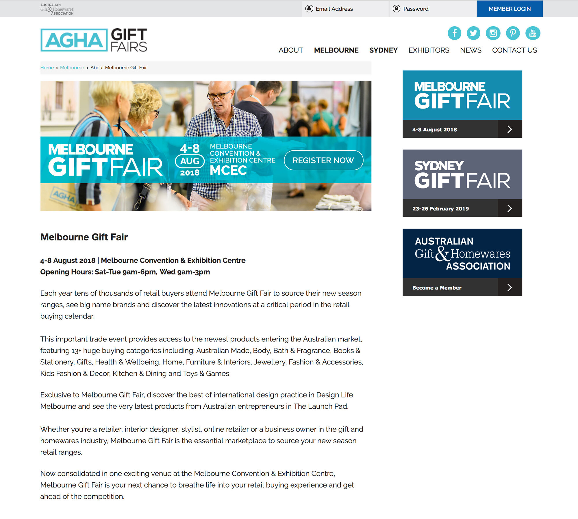
This website contained information about visiting the Gift Fairs and exhibiting at the Gift Fairs in Melbourne and Sydney. This website was heavily targeted for the Gift Fair visitors.
Qualitative research through interviews and observations with 6 key personas and 5 stakeholders revealed the following pain points and opportunities:
The information about exhibiting is hard to find and confusing. Applying to exhibit requires multiple visits to different pages on the website.
”How might we make it less confusing and easier for potential exhibitors who will become AGHA wholesale members to apply to exhibit in the Gift Fairs?”There was no specific page for AGHA sales team to promote to exhibitors, especially the new potential exhibitors. Current exhibitor page doesn’t provide data, reports or reviews for sales team to attract potential exhibitors.
”How might we enable the AGHA sales team to promote to existing and potential exhibitors?”The potential exhibitor couldn't find information about how to exhibit and its benefits on the website. There is no single source of information, too many mediums carrying scattered information.
”How might we improve the user journey so that potential exhibitors would be able to easily find information about exhibiting at the Gift Fair?”
Majority of our users visit only the Gift Fairs website to find relevant information, the AGHA (corporate/association) website consequently had minimal traffic, thus losing significant membership application opportunities and conversions
”How might we improve ease of access to information about the membership application?”The Gift Fairs website had a vast amount of information stowed in the multi-nested dropdown menu, which caused poor visibility and access to the information, especially on mobile responsive
”How might we improve the navigation around important information, especially on mobile responsive?”Deeply structured pages with their respective image headings made updating content on the website very tedious, which contributed to a high frequency of human errors (i.e. manually updating links between pages, updating header images, etc.)
”How might we simplify the structure of the website so it is significantly less tedious to update?”
User Journey Mapping
Exhibitor Journey
Visitor Journey
The Solution
After looking at the problems in greater detail, they resonated with the key challenges.
Drowning in Information
To solve this first challenge, we improve the information architecture by creating two sections, each dedicated to the exhibitor journey and the visitor journey within the website homepage. Each of the journey imitates the thinking process of each user type (the exhibitor and the visitor).
Confusing Maze of Navigation
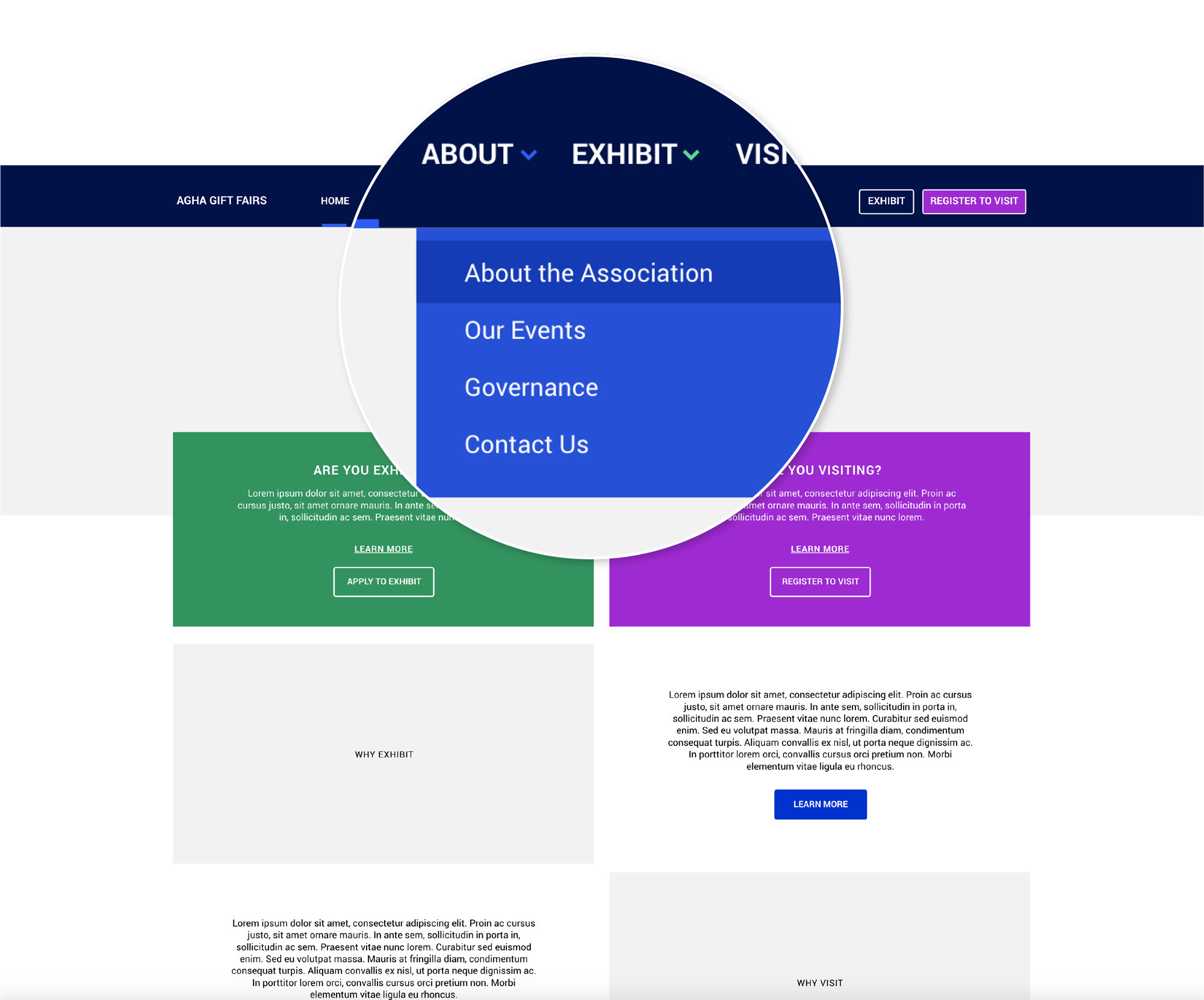
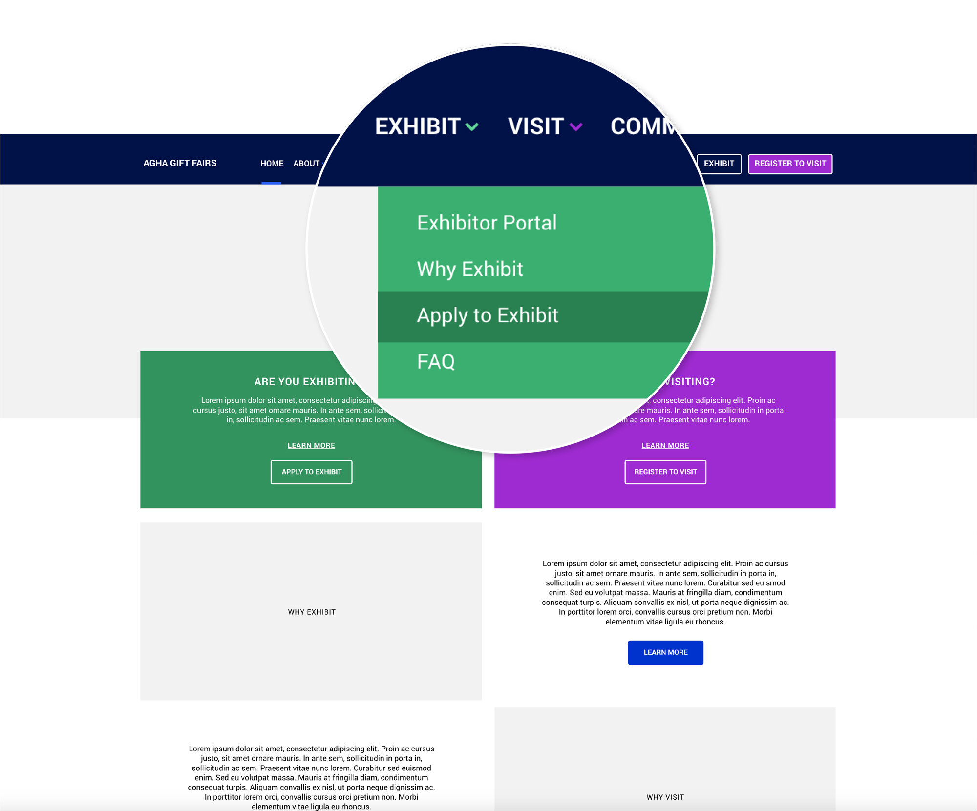
We simplified the menu to only have one level of navigation to promote clear navigation. The two most important call-to-actions for our key personas: “Apply to Exhibit” (for exhibitors) and “Register to Visit” (for visitors) are always available on the top menu at all times. Information about the Association and joining the community/membership is also available on the main menu.
The exhibitor section contains all information in one page about everything related to exhibiting at the AGHA Gift Fair and its benefits including:
When and where to exhibit
Why exhibit
Who the visitors/buyers are
Reviews from other exhibitors
Past Gift Fair reports
Sales prospectus
Venue and dates
Floor plans
Apply to exhibit form
The visitor section contains all information in one page about everything related to visiting the AGHA Gift Fair and its benefits including:
When and where the next event is
Who the exhibitors are
What products are available
What activities are happening
How to plan the trip
How to make the most out of the event
How to network
Reviews from past visitors
Newsletter subscription
How to become a member
Register to visit form
Register to become a member form
Wireframes
After several brainstorming and ideation sessions with the stakeholders, we came up with some hypotheses that we would like to validate and produced a series of mid-fidelity wireframes to be used in recorded usability testing.
Hypotheses
A single website can serve both type of audience (exhibitors and visitors) if given a clear separation of concerns
Information about membership and the association is secondary to the immediate need to exhibit and visit the Gift Fairs
Homepage
The homepage prominently featured two bold call-to-actions to immediately redirect each type of audience to their respective journey.
Clicking “Apply to Exhibit” directs users to become an exhibitor. Clicking “Learn More” provides them information on the benefits exhibiting at a Gift Fairs.
Clicking “Register to Visit” directs users to the registration form. Similarly, clicking “Learn More” provides them information on the benefits of attending a Gift Fairs.
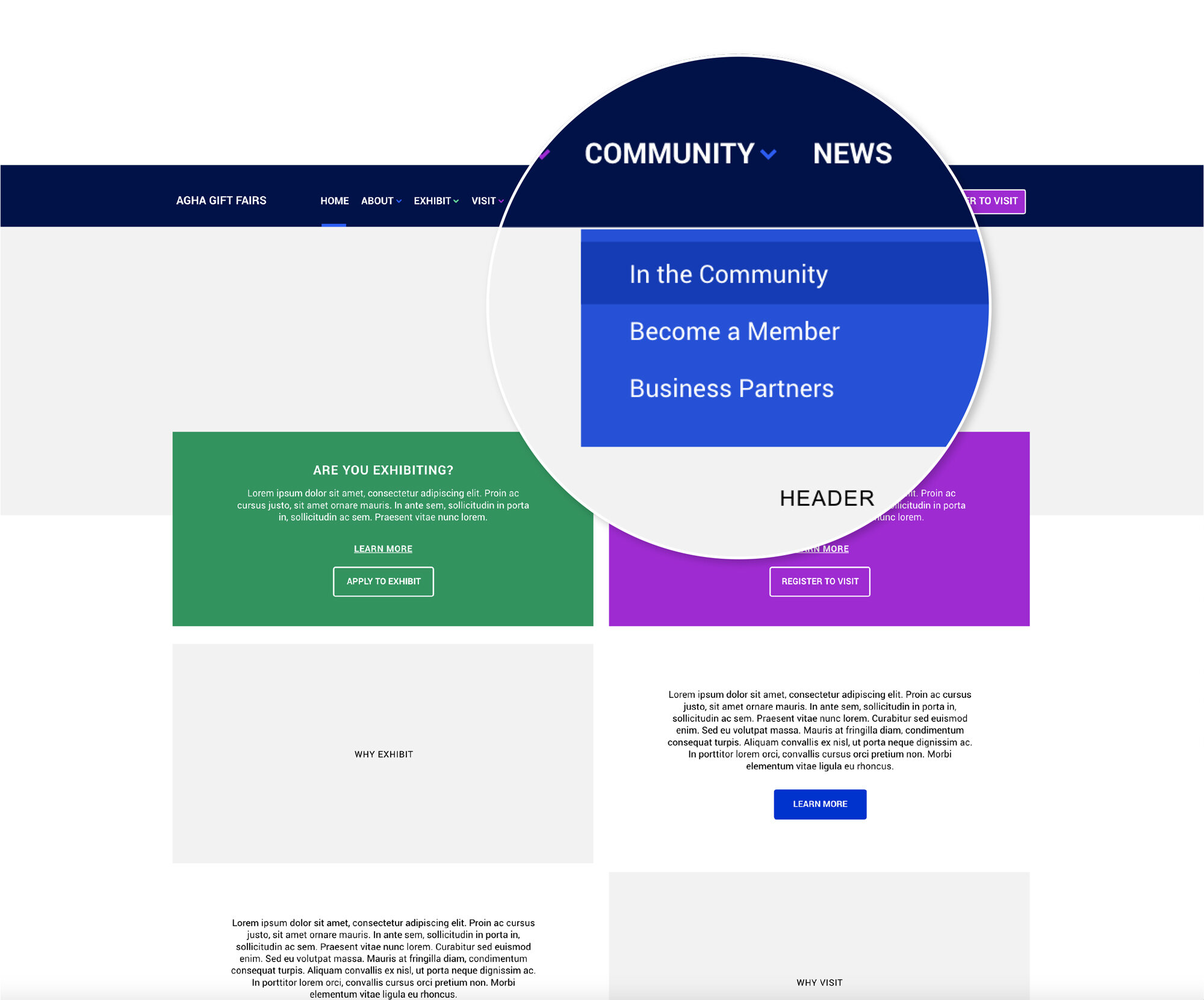
The homepage featured an excerpt about the association. More information about becoming a member was included under the “Community” page.
Homepage
Homepage - About Dropdown
Homepage - Visit Dropdown
Homepage - Exhibit Dropdown
Homepage - Community Dropdown
Exhibit - Apply to Exhibit page
Visit - Sydney Gift Fair page
Community - In the Community page
Usability Testing
We invited our key personas to our office for recorded usability testing where we assigned clear tasks based on the user stories to each key persona to complete using the produced mid-fidelity wireframes.
Exhibitor Tasks
Find out how to exhibit
Find out the benefits of exhibiting
Find out about the dates and venue of the next Gift Fair
Apply to exhibit
Find out who are my potential buyers
Find out more about the association
Visitor Tasks
Find out how to become a member
Find out the benefits of becoming a member
Find out about the next Gift Fair
Find out who will be exhibiting at the Gift Fair
Find out the benefits of attending the Gift Fair
Find out more about the association
We requested them to run through their tasks without any help from our side. We observed, asked open-ended questions, and took notes but offered neither guidance nor correction.
Outcome
Our test users were able to complete most of the tasks with relative ease with absolutely no guidance. Our exhibitor personas naturally gravitated towards the “Apply to Exhibit” and “Learn more” about exhibiting call-to-actions as did our visitor personas towards the “Register to Visit” and “Learn more” about attending.
Both personas naturally clicked “About” when completing the “Find out more about the association” task. Our visitor personas had a bit of trouble completing the “becoming a member” tasks. After a while, they eventually found out how to become a member through the “Community” page.
Lessons Learned
The information on how to become a member was hard for the user to find as it was tucked under the “Community” page. This could have been made more apparent on the menu.
Conclusion
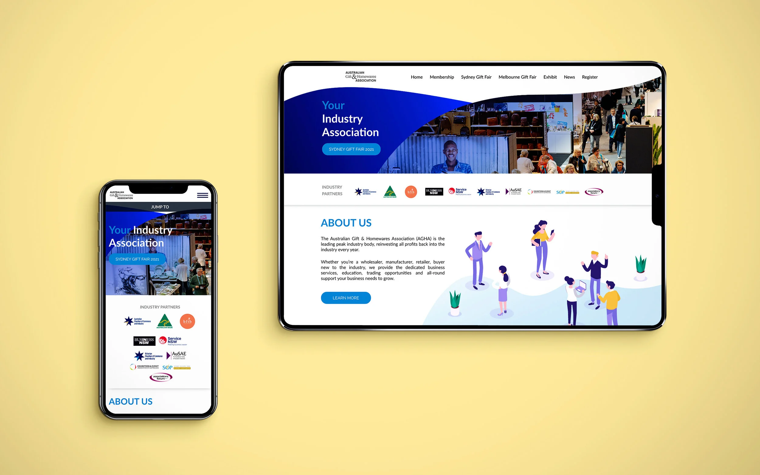
Some of the elements found in the usability testings were applied in the new website, such as having one website that provides information about the Association, the Gift Fairs, how to Exhibit and Membership. The key information is readily available on the homepage as well as on the menu/top navigation. The membership page has generated 30% increase in the first 3 months of launching the new website.
New Homepage

